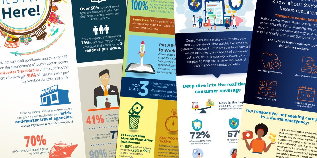
Your Infographic Looks Good. But Does It Communicate?
A polished infographic still needs a clear message. Five practical ways to sharpen the takeaway, guide the reader, and give every design choice a purpose.

A polished infographic still needs a clear message. Five practical ways to sharpen the takeaway, guide the reader, and give every design choice a purpose.

An image can look perfectly sharp in an email and fall apart when you put it in a layout. Before I do anything to the file, I want to know how big it needs to be and where it’s going. An image that works for a little spot on a web page may have a very different job on the cover of a white paper.
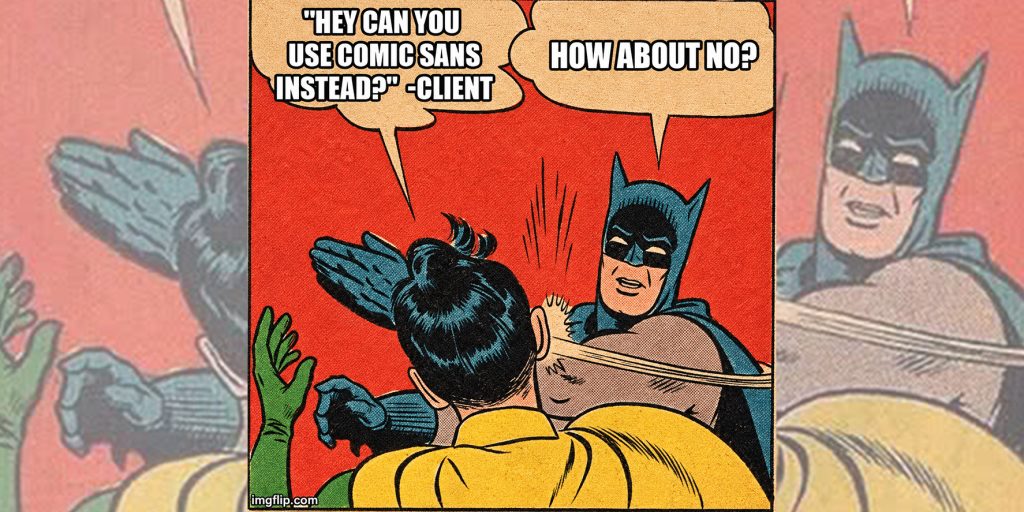
Comic Sans is the Crocs of typography. Comfortable, easy to slip into, and capable of making everyone forget what you just said in a job interview.

Your pitch deck has a couple of minutes to make its case. Spend them on the story, the numbers, and the ask. The tiny rocket can sit this one out.

Everybody brought a slide. Nobody brought a deck. Here’s how to get the fonts, colors, and borrowed slides to look like they belong in the same PowerPoint.

If your brand feels fine, that’s your first warning sign. Here are five clues it’s time for a refresh.

Your blue looked right until you added a drop shadow. Here’s how to track down where the color shifted and get the PDF back on track.

A third font showed up to help. Now what? Five practical ways to improve your typography, from choosing fewer fonts to testing your work on a phone.