CREATIVE EDGE · INFOGRAPHICS
Your Infographic Looks Good. But Does It Communicate?
By Steve Raia · September 3, 2026
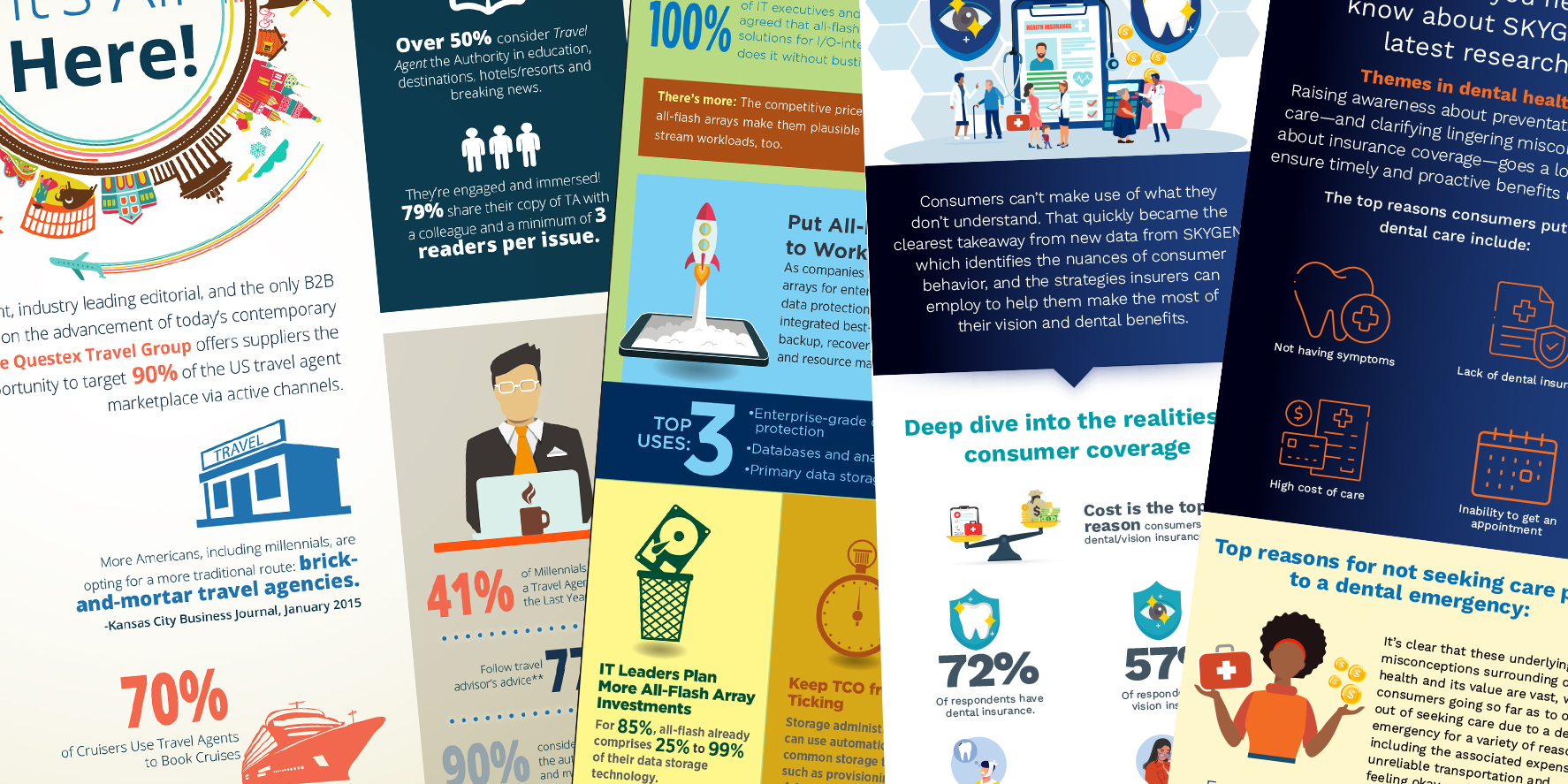
An infographic can look polished and still leave the reader wondering what it was trying to say. Before I choose icons, colors, or chart styles, I want to know one thing: What should someone understand after reading it? That answer guides the design.
When I think of infogs that went well, one set comes to mind immediately. I worked on a series of infographics for Dun & Bradstreet that I’m still happy with. They came in with copy that was pretty much ready, we agreed on a look for the series, and once we had an approach, they didn’t keep poking at it. The copy came in bite-sized sections, so I could carry an illustration idea from the hero down through each section and lead the reader to the call to action.
That bite-sized copy is often the hardest part. Sometimes you’re handed an encyclopedia’s worth of material for something that’s meant to be visual. Start with the headline. If the most useful insight is buried halfway down the page, bring it forward. A solid headline should be engaging but still tell readers what you’re covering. A takeaway gives them a reason to keep reading. If the story needs several pages of explanation, the client may be asking for an infographic when what they really need is room to tell a longer story. An ebook or an interactive landing page can give readers room to explore it at their own pace.
Once the focus is clear, give it a visual hierarchy. Typography, spacing, scale, and contrast help readers see where to start and how the pieces connect. Use color to your advantage, too. A simple palette can do plenty when you use color consistently to identify a category, highlight a finding, or tie related information together.
Be willing to edit your own work. An extra icon or background shape might fill a gap without helping anyone understand the story. Sometimes that gap is doing more for the page than anything you could put there. If everything demands attention, the reader has to do the work of figuring out what matters.
Give the piece an ending, too. That could be a short conclusion, a next step, or a simple call to action. Before publishing, get a fresh set of eyes on the work if you can. Show it to someone who’s new to the subject and ask what they took away from it. If they come away with a different point than the one you intended, ask what led them there. Their answer can help you pinpoint where the disconnect happened.
I like to have the copy and direction about 90 percent there before I start designing. I leave room for that last 10 percent because sometimes a client sees their copy alongside a custom illustration and spots an angle neither of us saw in the draft. That’s when it pays to give the piece a little room to tell you what it wants to be.
I hope this gave you something to think about. More from the Steve Blender soon.
To be continued.

© 2026 Game6Media · Steve Raia · Westbury, New York