CREATIVE EDGE · TYPOGRAPHY
Five Ways to Level Up Your Type Game
By Steve Raia · November 19, 2026
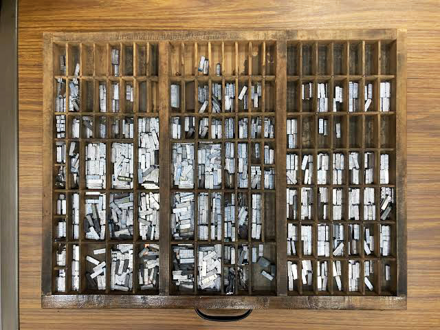
We don’t just design great typography …we kern it.
We’ve come a long way from the California Job Case, but the basic principles remain. You can feel when the type on a page is fighting itself. The headline and subhead are both asking for your attention. The body copy is packed into a corner. Somewhere along the way, a third font showed up to help.
Before you go looking for a better typeface, try these five fixes.
1. Use fewer fonts.
Two’s company. Three’s a crowd. Before adding another font, see what you can do with the weights you already have. A strong headline and a comfortable reading weight from the same family can carry an entire white paper. Give every font a job. If two are doing the same thing, one can go.
2. Mind your hierarchy.
Headlines shout. Subheads explain. Body text whispers, but you should still be able to hear it.
Zoom out until the copy is too small to read. Can you tell where to start and what to look at next? If everything is bold, big, or bright, pick the one thing that deserves to go first.
3. Respect line spacing.
Give your words room to breathe. In a dense paragraph, a little extra leading can make it easier to find the next line. In a two-line headline, too much space can pull one thought apart. Judge the spacing with real copy in place. Three tidy lines of placeholder text will let you get away with almost anything.
4. Give the type enough contrast.
Light gray type on white can look elegant when you’re designing at full brightness. Try reading it with the screen dimmed. If the words start to disappear, give them more contrast or a little more weight. On a photo, check the busiest part behind the words. That’s where the type has to earn its keep.
5. Optimize online work for multiple viewports.
Looks good on your laptop? Cool. Now open it on your phone. Yikes!
Open the same link or PDF your reader will get. Read a paragraph, look for the next heading, and try tapping a link. If you’re already pinching and zooming on the first page, you’ve found something worth fixing.
Type has a job to do. Make every word count.
I hope this gave you something to think about. More from the Steve Blender soon.
To be continued.

© 2026 Game6Media · Steve Raia · Westbury, New York