CREATIVE EDGE · TYPOGRAPHY
We Need to Talk About Comic Sans
By Steve Raia · November 1, 2026
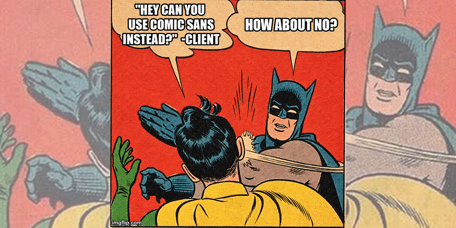
Comic Sans is the Crocs of typography. Comfortable, easy to slip into, and capable of making everyone forget what you just said in a job interview.
I made a LinkedIn carousel with five reasons to delete it forever. “Forever” might be a little harsh. I’d settle for getting it off your capabilities deck.
1. It makes serious news sound optional
“We need to talk about the budget” already does plenty of work. Set it in Comic Sans and suddenly it sounds like the budget is missing three juice boxes.
2. It can undo a first impression in one slide
You spent three weeks getting the pitch right. The numbers are solid. The case studies are sharp. Then slide one walks into the room in Crocs.
3. It brings its own baggage
Fonts pick up associations from where we’ve seen them. Comic Sans has been on enough bake sale flyers and “mandatory fun” memos to bring both into the room with it. Now your cybersecurity white paper smells faintly of brownies.
4. You have other ways to sound friendly
Try Poppins if you want something rounded and approachable. Raleway can give a headline a lighter touch. And sometimes the fastest way to make a page sound human is to take “leveraging best-in-class solutions” out of the first sentence.
5. Your designer will thank you
We’ve all opened a file called FINAL_v7_USE_THIS_ONE and found something we weren’t prepared for. You can spare us one small surprise.
Comic Sans has a place. If a seven-year-old is selling brownies, I’m buying. If your company is selling enterprise software, give me a call before slide one.
I hope this gave you something to think about. More from the Steve Blender soon.
To be continued.

© 2026 Game6Media · Steve Raia · Westbury, New York